


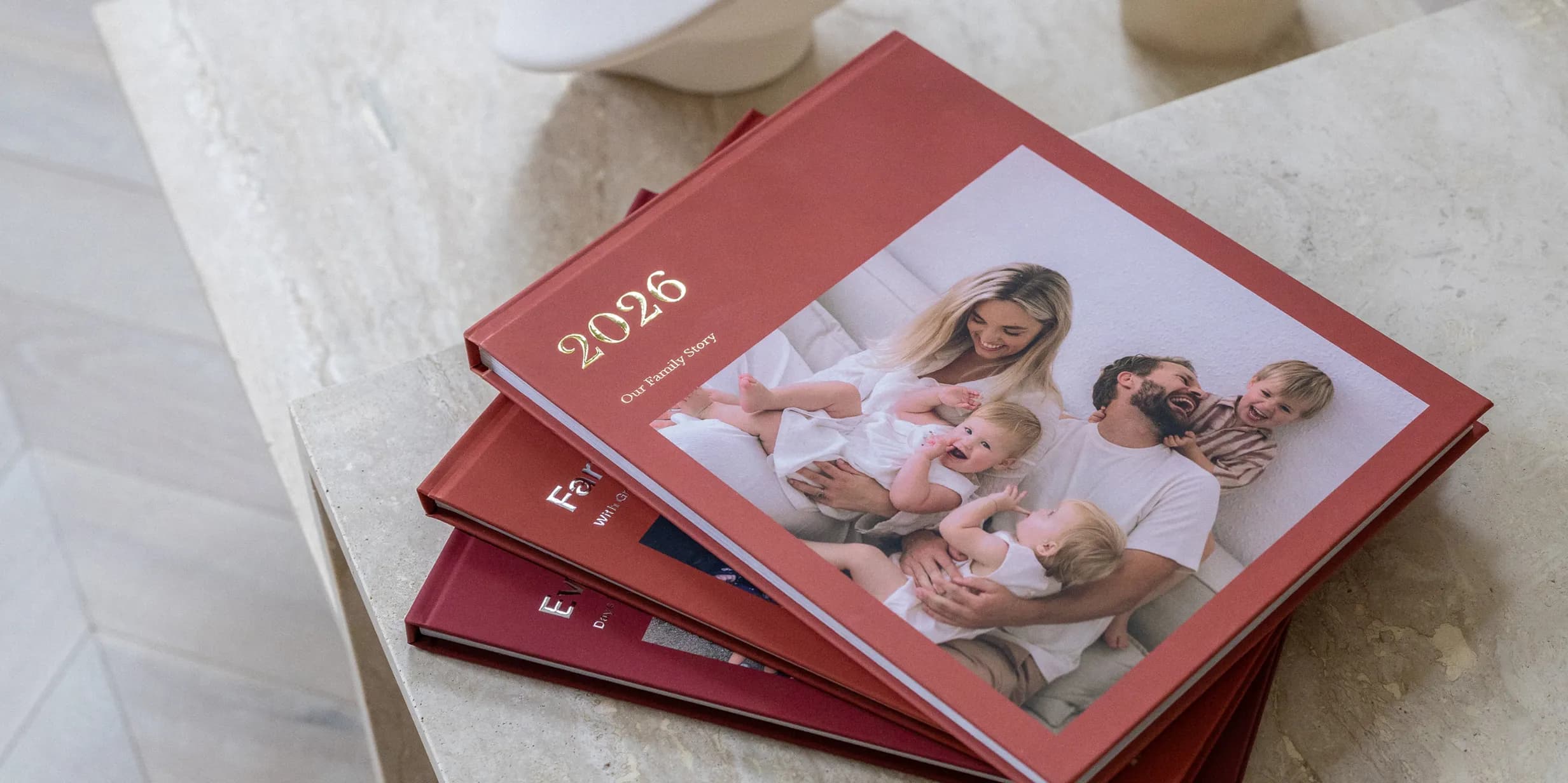
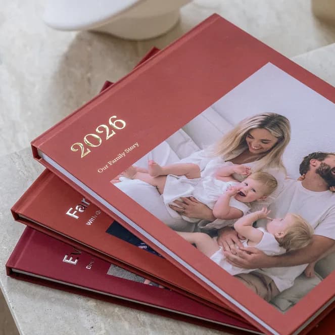
Most Photo Books live on a shelf. A coffee table Photo Book is different: it’s designed to be left out, picked up by guests and leafed through while the kettle boils. What separates the two isn’t printing or price. It’s editing. The books people linger over are the ones with fewer, better photos, given room to breathe on big pages. This guide covers choosing those photos, laying them out, and which size, paper and binding make a book worth leaving out.
What makes a book coffee-table quality
Think about the published coffee table books you’ve enjoyed looking at. They share a clear subject, a small number of strong images, generous white space, and a size and weight that feel substantial. Someone has already done the hard work of choosing, so the reader gets the best.
Your own coffee table book should work the same way. Pick a single subject, such as one trip, one year, one place or one person, rather than trying to cover everything. Aim for a book someone who wasn’t there would still enjoy, because that’s who will pick it up. If a photo only means something because you remember the moment, it belongs in a different book.
Choosing 40 photos instead of 400
Here’s the hard rule: a coffee table Photo Book should contain no more than 40 photos. That may feel brutal with 400 from a two-week holiday, but it’s what makes the book work. Fewer photos means each gets a big page, and the reader actually looks at every image instead of skimming.
Use this four-round method to get there. In round one, go through everything from the trip or period and favourite anything that catches your eye. Expect 100 to 150. In round two, remove every duplicate and near-duplicate. If you have six shots of the same view, keep the best and delete the rest from your selection. Remove anything blurry, badly lit or awkwardly cropped. This usually halves the pile.
In round three, apply the frame test. For each remaining photo, ask whether you’d be happy to see it printed large and framed. If the honest answer is no, it goes. This round hurts most, and makes the biggest difference. You should now have around 60.
In round four, build the story and cut to 40. Choose a strong opening image and a quiet closing. Then check the mix: wide shots that set the scene, detail shots of food, textures and objects, and a handful of photos with people. If you have ten similar landscapes, keep the best three. Keep going until you hit 40. If you can’t choose between two photos, cut both and see if you miss either.
One image per spread and why it works
A spread is the two facing pages you see when a book lies open. In most Photo Books, those pages are filled with several photos in a grid. For a coffee table book, try the opposite: give each of your strongest images a whole spread, or place a single photo on one page with the facing page blank or holding a short caption.
It works because it slows the reader. One image on a spread has no competition, so the eye takes it in properly, and the white space signals that this photo matters. Collage pages, by contrast, ask the reader to scan, and scanning is what people do just before putting a book down.
With 40 photos, a good rhythm is to give your best eight to ten images a full spread each, and place the rest one per page. That gives you around 50 pages, substantial enough to feel like a proper coffee table book without dragging. An occasional page pairing a wide shot with a detail adds variety.

Minimal layouts
Size, paper and binding
Size matters more for a coffee table book than any other. Small books get tucked away; large ones get left out. Choose a Large or Extra Large Hardcover Photo Book if you can, because big pages make the one-image-per-spread approach feel generous rather than empty. A hardcover also gives the book the weight and sturdiness to survive being picked up and passed around.
Before choosing a size, check your photos are up to it. Recent phone photos usually print well at large sizes, but heavily cropped images, screenshots and older low-resolution photos can look soft blown up across a big page. Zoom into each page in the preview and swap in a sharper shot wherever anything looks soft.
Popsa’s hardcover books are printed on thick matte paper as standard, with an upgrade to gloss. Matte suits most coffee table books: it reduces glare from lamps and windows, resists fingerprints, and gives the book an understated, gallery feel. Gloss is worth considering if your photos are bold and colourful, such as tropical beaches or city lights at night, and the book will sit without harsh overhead light.
Layflat vs standard
Standard binding works well where each photo sits on a single page. The pages curve slightly towards the spine, which isn’t noticeable when the image is on one side. But if you want photos across the full spread, layflat binding makes a big difference. It lets each spread open completely flat, with no dip in the middle, so a panoramic landscape or a group photo can stretch across both pages without anything important disappearing into the fold.
For a coffee table book built around full-spread images, layflat is usually worth it. If most images sit on single pages, standard binding will do the job and keep the cost down. Our guide to whether Layflat Photo Books are worth it goes into the trade-offs.

Big pages, bold moments
Covers and titles
The cover is the only page every guest will see, so treat it as the most important decision. Choose an image that works at a glance: simple, striking and readable from across the room. A strong landscape or a single well-composed detail often works better than a busy group shot. Leave clear space in the image for the title.
Keep the title short and understated. A place and a year, such as “Lisbon, 2026”, or a single evocative word, looks more considered than a long sentence. Gold or silver foil lettering adds a finishing touch that catches the light, and a title on the spine means the book still looks good stacked with others.
Common mistakes
The most common mistake is including too many photos, which is why the selection rules above matter. Close behind are collage pages that cram six or eight images together, and repeating the same scene from slightly different angles. Mixed editing styles also let a book down. If some photos have strong filters and others don’t, the pages won’t feel like they belong together. Either edit them consistently or leave them natural.
Watch out for faces or key details falling into the fold of a standard-bound spread, and for captions on every page. A coffee table book needs very few words; a place name or a date on a handful of pages is enough. Finally, proofread every page in the preview before you order, because a typo on the cover is far more noticeable in a book designed to be looked at closely.
For inspiration on subjects that suit this style, browse our travel Photo Book ideas, then start your coffee table Photo Book in the Popsa app.
Chargement…
Foire aux questions
How many photos should a coffee table Photo Book have?
What size is best for a coffee table Photo Book?
Should a coffee table book be matte or gloss?
Is layflat binding necessary?
Téléchargez l'application
Replongez dans vos souvenirs en toute simplicité grâce à des fonctionnalités exclusives comme la reconnaissance faciale et les albums intelligents.


Articles connexes
&w=96&q=75)

&w=96&q=75)
Nathan Cook
Écrivain Popsa
20 janv. 2026∙7 min


 États-Unis