




The hallway is one of the most overlooked spaces in a home, yet it’s one of the few that almost every visitor passes through. It’s the first thing you see when you come in, and the last thing you see when you leave. Most gallery wall advice is written for living rooms – wide walls, good light, somewhere you sit and linger. A hallway works differently, and the standard guidance often falls short.
Why photo tiles suit a hallway
Framed prints can be tricky in a narrow space – they need careful hanging, they catch the light awkwardly, and a wonky one in a hallway is impossible to ignore. Popsa’s Photo Tiles come ready-framed in either black or white, with a peel-and-stick adhesive backing, so there are no nails, no spirit levels and no holes to patch up later. They’re lightweight enough to rearrange when you want to and the standard finish is designed to minimise reflections, which helps under hallway lighting. There’s also an optional plexiglass upgrade if you want a glazed, more traditional look.
Strip layouts vs clustered arrangements
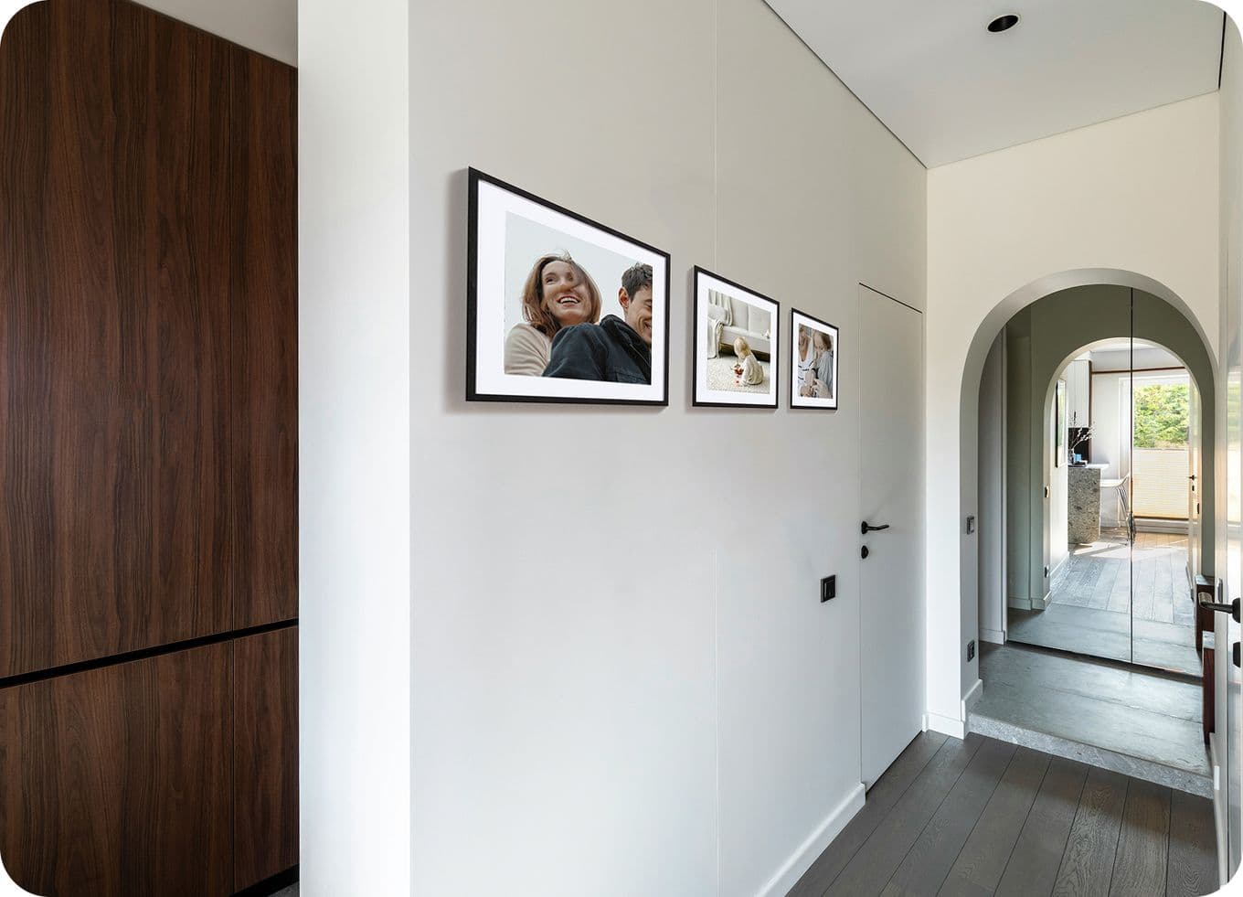
A long, narrow corridor suits a strip layout – a horizontal line of photo tiles at eye level, evenly spaced, running with the direction of travel. This works because it gives people something to follow as they walk through, and it suits the proportions of the wall. A cluster arrangement, where tiles are grouped more densely, tends to work better near a focal point – at the end of the hallway, around a door frame or above a console table where people slow down for a moment.
How many tiles fit without feeling cluttered?
Hallways have less visual room than they look like they do. Because you tend to see the wall at an angle rather than head-on, a tile that would feel comfortable in a living room can feel busy here. A loose guide: for a strip, aim for one tile every 40-60cm, with consistent spacing. For a cluster, no more than seven or eight tiles in a single grouping before it starts to feel crowded.
The instinct is to fill the wall – resist it. Empty space around the tiles is what makes the photos themselves stand out. A smaller, tighter arrangement almost always reads better than a wall packed corner to corner.
Working with low light
Most hallways don’t have natural light, and the artificial light is rarely flattering. Photo tiles help here in two ways. The standard finish is designed to cut down on reflections from overhead lights – a real advantage over glass-framed prints, which can mirror the ceiling lamp back at you. And because tiles sit close to the wall, they don’t cast the small shadows that bulkier framed photos sometimes do in low light. If you can add a picture light or a small lamp on a side table, the wall comes alive.
Why personal photos work best
Art prints can look great in a living room, where you spend time looking at them. In a hallway, where the encounter is brief, personal photos are better. They draw the eye in a way a print doesn’t, because they reward a second glance. A guest pausing to look at a photo tile of your family on holiday or your kids on a beach is a different experience to walking past a generic print – there’s someone to recognise, something to ask about. Regularly looking at old photos also has a quiet emotional effect on the people who live there: small reminders of who and what matters, encountered every day.
A note on colour and frame choice
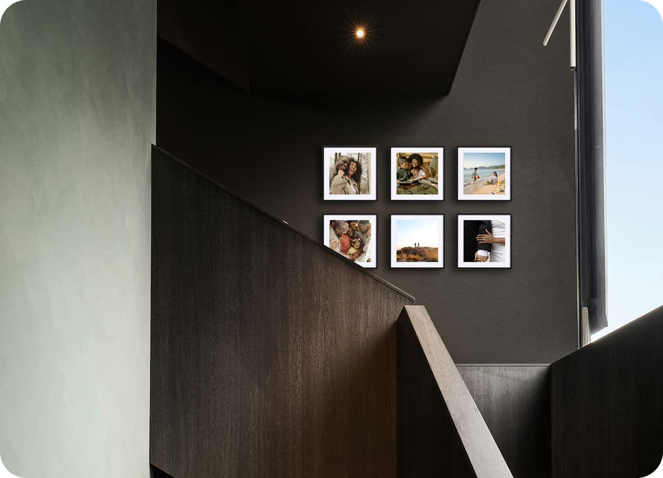
The frame choice sets the tone as much as the photos do. Popsa’s Photo Tiles come in black or white, and the decision is mostly about the wall behind them. White frames lift a darker hallway and keep the focus on the images; black frames give the arrangement more weight and work well on lighter walls or in brighter spaces. Sticking to one colour across the whole arrangement is usually the safer choice – mixing black and white can work in a cluster but tends to look busy in a strip.
Arranging them on the wall
Lay the photo tiles out on the floor first. Move things around until it feels right, then take a photo of it on your phone before you start sticking anything up. With Popsa Photo Tiles, the adhesive lets you reposition without leaving marks, so you’ve got room to adjust if something doesn’t quite work the first time. Hang at eye level, which in a hallway means around 145-150cm to the centre of the arrangement. A hallway gallery wall doesn’t need to be ambitious to work. A small, well-chosen group of photos, arranged with a bit of thought, in the right kind of light, is enough.
Lataa sovellus
Löydä muistoja nopeammin kasvojentunnuksen, älykkäiden albumeiden ja muiden ainutlaatuisten ominaisuuksien ansiosta.




&w=96&q=75)

&w=96&q=75)



 Yhdysvallat