Guides
Pro tips: elevate any Photo Book with negative space
A simple technique that proves that less is more, discover how using blank space can bring your Photo Book to life


Guides
A simple technique that proves that less is more, discover how using blank space can bring your Photo Book to life
For anyone keen to maximise the impact of their images when creating a Photo Book with Popsa, an underrated trick is to lean on what’s referred to in art and design as “negative space” – the empty area around and between objects.
Adopting a few simple tweaks when approaching your layout can have a transformative effect on the end result, according to Andy Paulson, video and content lead at Popsa. “Rather than trying to squeeze lots of photos onto each page, play around with minimalism by creating negative – or empty – space,” he says. “It’ll give better balance to the pages and draw more attention to what’s happening in the photographs.”
Here, he shares his top tips for enhancing your Photo Book design using blank space to create a more high-end feel for your finished product.
If you’ve already started making your Photo Book, skip this and go directly to the next step. If you’re beginning from scratch, simply open the Popsa app and select which photos you want to include in your book. You can add them directly from your camera roll or from social media. Make sure you’ve shared full access to your photos with Popsa in your phone settings or this part won’t work – and you’ll miss out on great app features.

For the quickest route to a minimalist look, tap the window-shaped Templates icon above any page, and select Minimal from the menu bar at the top. There, you’ll see layout options that deliberately leave blank space around the photographs. The options range from one stand-alone image to a collage of four. If the image is quite busy, consider giving it an entire page to itself so it has breathing room. Or if two specific photos really complement each other, give them a side-by-side display. Alternatively, pick whichever version suits your photographs best.

For an even more bespoke layout, next to the Minimal button on the Templates page, select Collage. Use a template with multiple spaces for photos. After it automatically adds your images, try removing one to create blank space. To do so, just long-press a photo and drag it to the photo album icon at the bottom. It’ll stay there with other disused photos you uploaded in case you change your mind. Experiment with different gap placements and layouts to suit the vibe of your photographs.

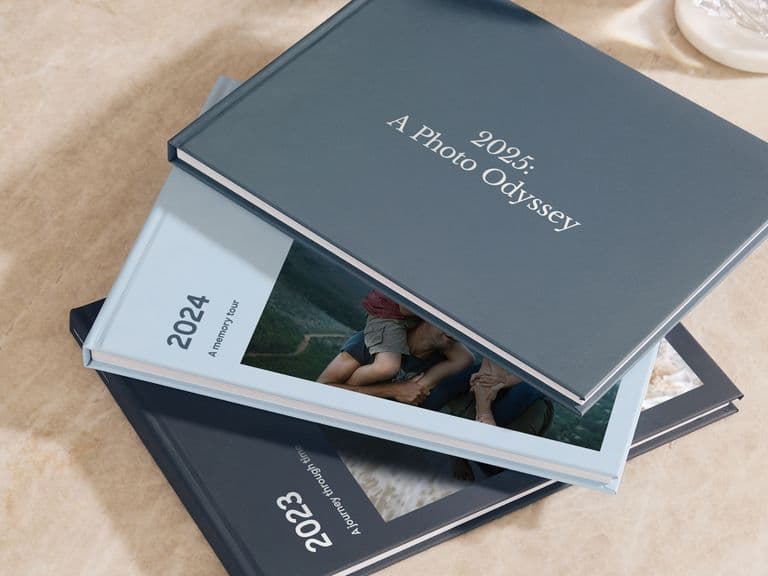
Tap the Themes icon at the bottom of the screen. Choose a light colour from the Neutral panel to give your book a more premium look. Alternatively, browse the Textures colour options for a light pattern marbling effect. Stick with white, cream and beige colours to give a more luxurious and spacious feel to your finished book.

Be sure to preview your Photo Book by tapping Options at the bottom of the screen, then tap Preview in 3D to see how your layouts will look when the book is printed. Flick through the pages in 3D or try the AR version to see how it’ll look on your coffee table when it arrives.

If you really want to make a spectacle of your creation, choose premium Gloss so the pages glide through your fingers. To make the outside shine, add silver or gold foiling to the cover title so it stands out. And for the ultimate experience, upgrade to Layflat binding for ultra-thick pages that sit perfectly flat on any surface.
However you design your book, it’s practically impossible to go wrong. A collection of special memories will come to life in any layout. Using the steps above, you can take the experience to the next level, but feel free to experiment with different templates and colour schemes to find a version that pays perfect tribute to your memories. Happy creating!